Deciding the masthead font: I decided a sans-serif font would work better as it looks cleaner and more professional.

I liked this font for the way it has a slight lean forward- some of my target audience preferred this one as it seemed more professional. However, it is not common for film magazines to use italicised fonts.

 Initially, I liked the look of this font due to its uniqueness and the style of it. However, I did not go for this as it would be limiting with the colour palette possibilities and did not stand out to my audience feedback.
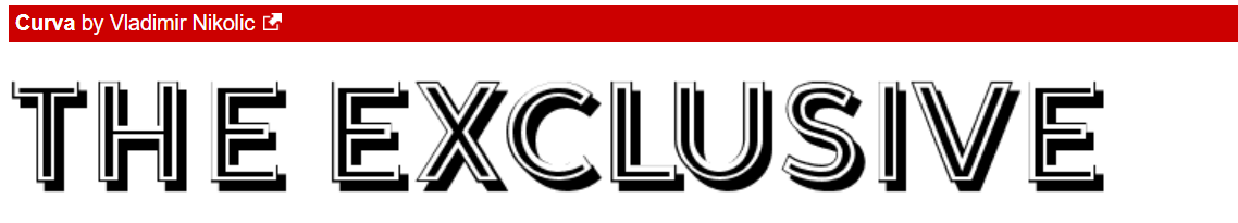
I tested different typography for the masthead as shown below. I am going to have the masthead Capitalised with the "THE" in a smaller size and just above the "EXCLUSIVE."


